
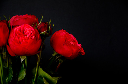
It's a pretty gloomy day here in Toronto today. I normally try to make the most of my Mondays because that is one day I get to myself, but today has been a struggle to even get out of bed. I am feeling lazy and just want to catch up on my tv shows. So it's fitting that I give you one of my gloomier shoots. I love the dark mood in this shoot, yet it is all very pretty. I have been experimenting with different backgrounds lately, I must say black is not very popular when it comes to shooting florals but it creates drama like no other.

 I was playing around with brightness post shoot, and noticed how both pictures had completely different mood simply because of increased brightness in the second one. But I absolutely love the first one, the flowers almost look like a Renaissance painting.
So here we go folks, I promise a much more cheerful post for tomorrow..nothing but colour in sight!
Can you spot the difference ;)
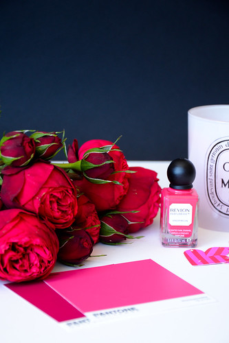
This is from last week, but I wanted to add it as another example of dark background
So here we go folks, I promise a much more cheerful post for tomorrow..nothing but colour in sight!


No comments:
Post a Comment